News

Welcome To Rockville announce 2026 stage times
How many bands can you feasibly see at Welcome To Rockville? It's time to find out...
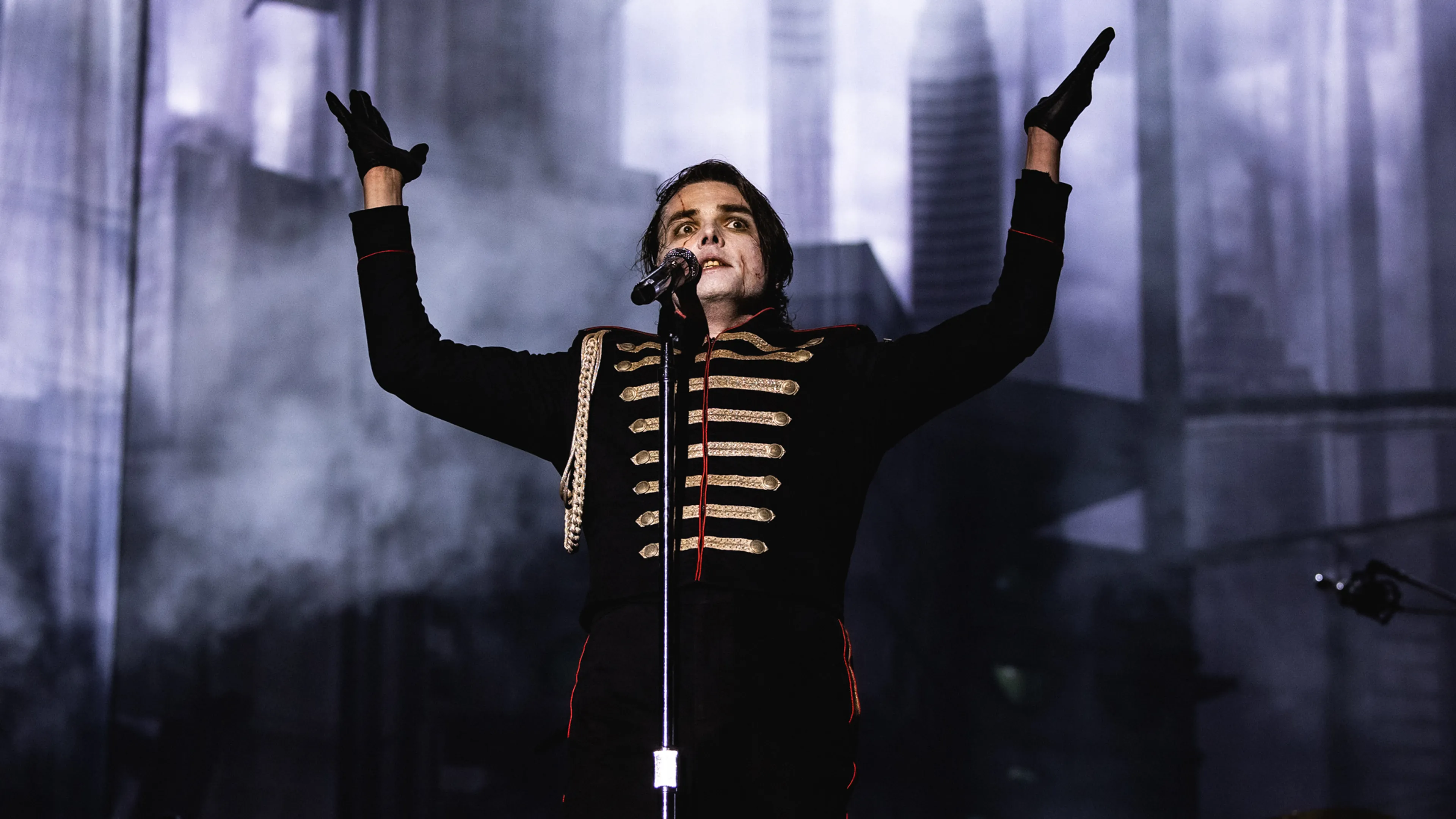
What are those strange symbols My Chemical Romance are using? And how do you actually create your own language? To find out, we met font whiz Nate Piekos to get the lowdown on how he and Gerard Way created Draag’s unique language of Keposhka, which has turned up on everything from birthday cakes to washing instructions…
A multi-award winning font designer and comics letterer, Nate Piekos has spent more than 20 years making words and logos look as cool as humanly possible. Having worked with everyone from Marvel and DC to Microsoft, he even penned the book on the subject with 2021’s The Essential Guide To Comic Book Lettering. One of his most enduring creative partnerships, however, has been with My Chemical Romance frontman and comic book writer/creator Gerard Way: dating back to their collaboration on The Umbrella Academy.
Last year, Gerard contacted Nate with an altogether new challenge. For the band's 2025 Long Live The Black Parade tour, MCR would usher fans into the dystopia of Draag – a world that required a language of its own. And Nate seemed like just the guy to make it happen. We caught up with the man himself to find out how the resulting language and its various fonts went from sketchbooks to stadiums.
How did you begin creating Keposhka?
“When Gerard first emailed me about this MCR tour, he said he wanted a language for it that felt oppressive, but brand new. He didn’t want to use an existing language that people could easily figure out: the universe should have its own language. Right from our first call he said, ‘It’s called Keposhka.’ I remember asking him, ‘Okay, how do you spell that?’ As we spoke I started sketching things out on graph paper, and he gave me parameters as far as what he liked. Keposhka has a heavy Cyrillic influence, but we were also looking at other languages, at hand-lettered [European] posters from the ’30s and ’40s. My first two sheets of sketches became our touchstone… I took them into the digital realm and used those for my reference. A lot of them didn’t end up in the finished set of fonts, but many others did. Eventually it became a style that we were both familiar with, so we were able to keep developing it.”
What came next?
“We decided that the numbers should be fairly plain. To begin with we thought this was going to be one or two fonts, used on merch and signage where numbers might be important to understand. But eventually, it ballooned to about 14 fonts. A lot are variations on a theme, so you have the regular, bold, the italic, the bold italic, condensed and ultra condensed… eventually even an English version to complement Keposhka when used side by side. Then we added a hybrid version, understandable as English but with the stylistic flair of the original. Early on we also made an agreement that we weren’t going to give the fans any kind of key to figure it out. In fact I threw in some curveballs where, when put together, certain [letters] swap out into one new letter. But as it turned out, the fans had most of those figured out within a couple days! MCR fans are very good sleuths.”
What were the biggest challenges along the way?
“I’ve been creating fonts for 20 years, but this was unique because it was essentially an alien language. Probably the biggest challenge was kerning: how any two glyphs work together when displayed side by side. Some need to get closer together and others further apart, based on the space around them. Like if you imagine a T next to an A, they have to scoot together because the T is wide at the top and the A is wide at the bottom – otherwise it looks like there’s a big space between them. While kerning English is tedious, I can shut off my brain and go kern for days. This was totally different. Every single pairing had to be considered. I spent a lot of time on the uppercase fonts, because I wanted it all to look intimidating. I also created punctuation, mainly based on regular Latin/English punctuation, and a whole system of accents that are totally new. I don’t think the accents have been used yet, but they’re there if needed! Meanwhile, the lowercase Keposhka has mostly been used on the side banner graphics, with the concert ‘rules’ written on them.”
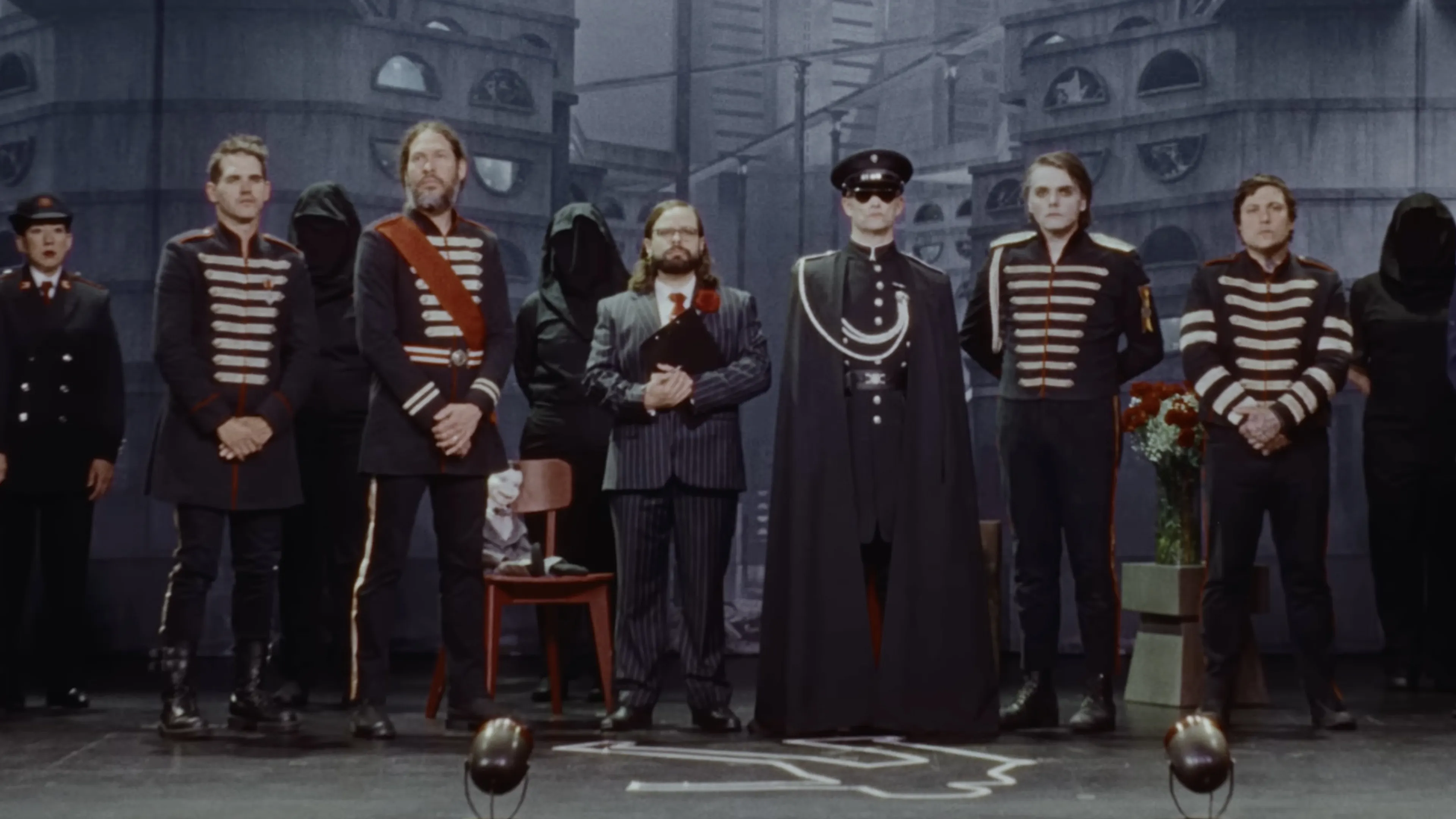
How did the new main MCR logo come together?
“Early on I scanned those first sheets of drawings and sent them on to Gerard. His assistant cut out every letter, put them in a glass jar, and together they sat on the floor of Gerard’s studio going through them. Gerard picked the symbols that would become the MCR logo, and one was actually his creation – a letter he was calling The Hangman, the R in MCR. We wanted one letter to be obviously a hint that it said MCR – that’s the C – and he picked that backwards K type letter as the M, probably for symmetry. He took a picture of those on the floor of his studio, sent it over, and then I turned everything into vectors on Adobe Illustrator. Designing a font is generally a two or three step process for me. It can begin as sketches, become a digital version on Illustrator, and once that’s all designed I take the pieces over to FontLab to do all the programming there.”
How would you describe your working relationship with MCR?
“Gerard is very good at letting people just do the thing they do. There were plenty of times in the design of Keposhka where he just said, ‘Love it, keep going,’ or, ‘Change this one bit, and then go to town.’ He was very hands-off, but also had clearly defined ideas that we could distil into the language. We were on the same wavelength, and when there were questions around what to do, he deferred to me as far as design goes. We know each other and get along well, so he’s a pleasure to work with. Gerard and his assistant were my main communication partners, but he did take things into band practice to show the guys, and they seemed really positive about it all.”
That early tour teaser video was the public’s first introduction to Keposhka.
“It was very early on when Gerard told me they were making a trailer, but I had no idea what the narrative was going to be. I had to get them some vectors of random glyphs that ended up dotted here and there on the buildings in the background – almost like signage. Then there were the captions when people were speaking, translated into Keposhka [in Keposhka condensed font] into the bottom of the screen. Once I saw that, it set the mood and I understood the context for Keposhka – how it was going to be incorporated. It was good for me too, because I was still working on more fonts. It confirmed that I had a grasp on what that world would look like.”
At what stage did the Yea/Nay signs from the ‘election’ part of the show enter the picture?
“Maybe a month or two before the first show. Gerard had to be able to see the audience’s choice from the stage, so both sides of every sign needed to look very distinctive from a distance. We opted for white on red for one side, and red on black for the other – using what we’d both come to see as ‘Keposhka red’. It was a great way to get the audience involved, which MCR are really good at anyway. Whole pallets of these things were being trucked in for the fans. We whipped them up quick, maybe in 30 minutes, and immediately it was, ‘Yep, this looks great.’ We brightened up the red a little and that was it. I’ve seen a lot of people framing them when they get home, trying to get more than one so they can have both sides on their wall. It’s a great keepsake that’s so unique to this tour, almost the modern extension of throwing guitar picks into the audience!”
What was the most rewarding part of the process for you?
“I work here in my studio, and oftentimes it’s just me by myself, in a vacuum, designing. It’s a heartwarming surprise to see how people embrace things once they leave my control. Over time Keposhka became real to me and Gerard because we worked with it every day. It was this intuitive thing we’d see and go, ‘Oh, that’s Keposhka.’ Then, once the first show happened, I started seeing all these photos of the stage, the huge signs and the merch. I love that, if you buy a T-shirt with Keposhka on it, the printed washing instructions are also in Keposhka!”
It’s amazing to see what people have done with it all.
“I never thought I’d see Keposhka written on a birthday cake, but it happened! I’ve seen photos of painted fingernails with the language on, custom socks, people getting it tattooed on them in different ways. It’s really impressive to see these creative ways the fans are using my designs, ways that I would have never imagined. I’ve been listening to and playing music since I was a kid, and I don’t think I’ve ever seen a tour quite like this – with the audience so incorporated. It fosters community, which is really cool in a day and age where we all need more things to feel good about. It’s nice to see a fanbase come together over a unique experience, and I’m grateful that everyone is enjoying the world we worked on together.”
You can see more of Nate Piekos’ work, and purchase his fonts, via Blambot. His book The Essential Guide To Comic Book Lettering is available now.
Get the special-edition My Chemical Romance Kerrang! zine.
Read this next: